
Case Study Klein's, a European skincare brand, wanted to create a strong, recognizable character in the competitive skincare market Klein's A Clinical Skincare Brand Read More
Klein's, a European skincare brand, wanted to create a strong, recognizable character in the competitive skincare market
Read MoreIntroduction
Klein's, a European skincare brand, wanted to create a strong, recognizable character in the competitive skincare market. Klein's aims to offer a diverse range of clinically effective treatments tailored to various skin types and concerns. In order to do this, Akki Studios created a thorough brand strategy that included packaging, visual identity, and logo design. This helped Klein's stand out in a crowded market and clearly convey its dedication to effectiveness and quality.
Branding Strategy
Rebop's branding revolves around creating a warm, inviting atmosphere that reflects the restaurant's passion for good food and hospitality. The brand's tagline, "A Culinary Journey," encapsulates the unique experience that awaits diners. Rebop's logo, featuring a vibrant palette and a playful design, further reinforces the brand's identity.
Brand Positioning and Identity
Klein's advertises itself as a premium skincare brand that provides effective answers to a variety of skin issues. The brand's core values include:
Clinical efficacy: Supported by scientific study and thorough testing.
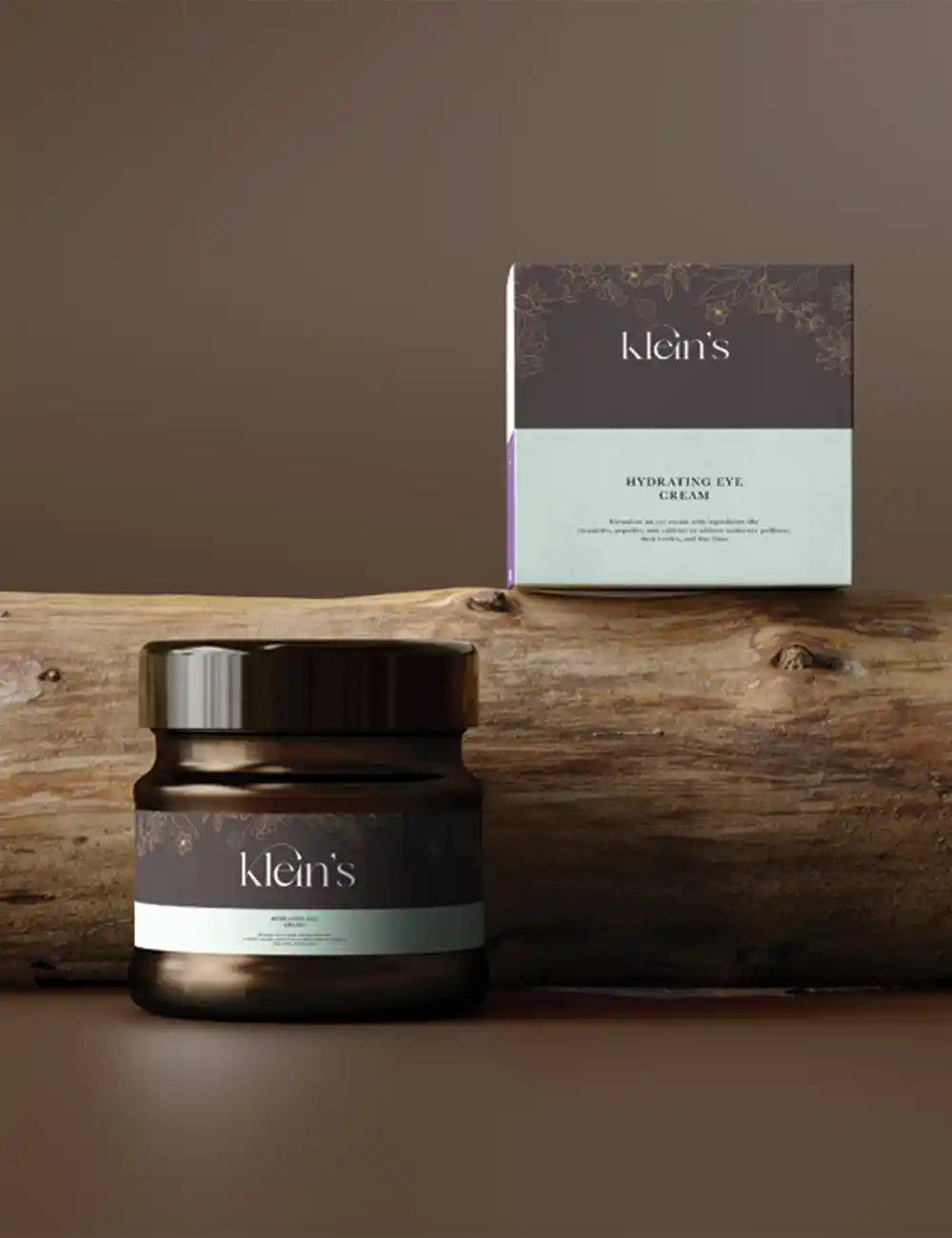
Minimalist Aesthetics: The packaging is clean and modern, reflecting the brand's concept.
Natural Ingredients: Using natural ingredients with proven effects.
Logo Design
The Klein logo was created to convey the brand's clinical and modern style. A bespoke typeface was chosen to give a sense of expertise and class. The color choice, which was largely black and white, underlined the brand's clinical focus.
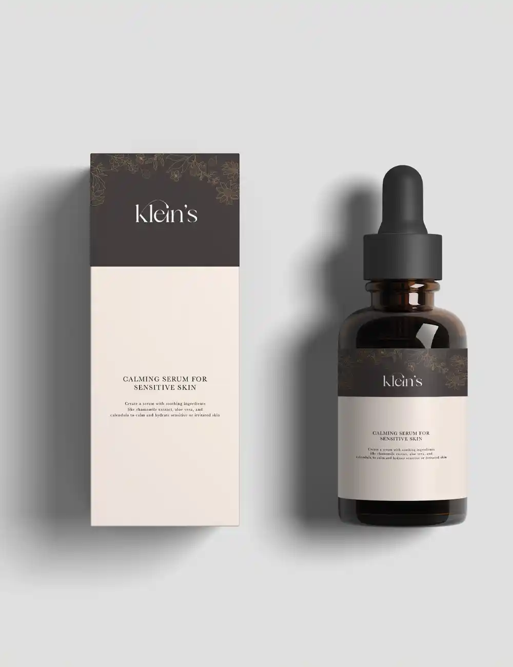
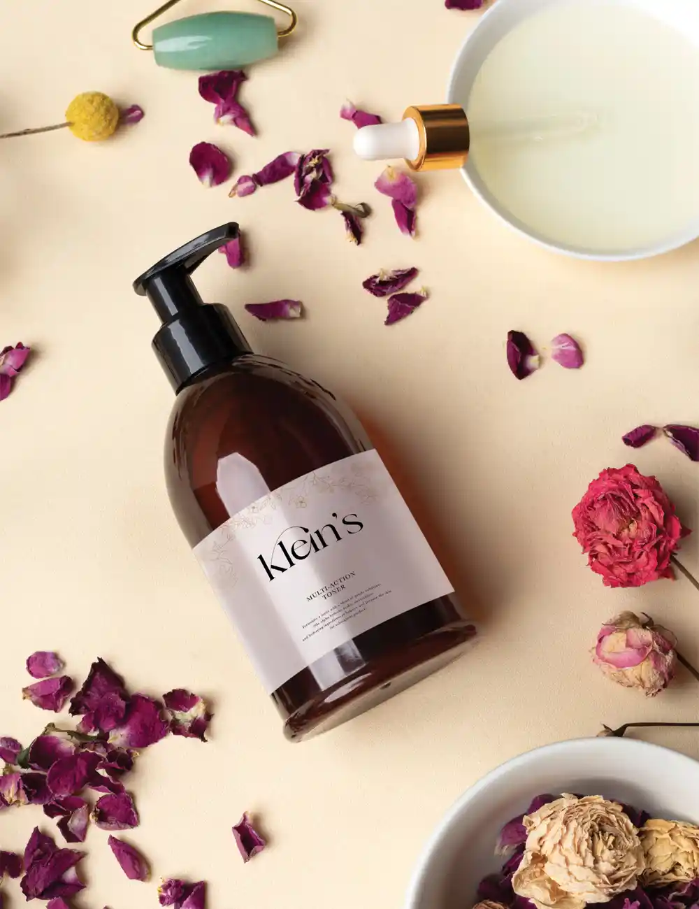
Packaging Design
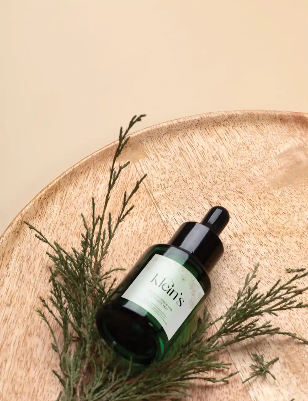
The goal of the packaging design was to produce a useful and aesthetically pleasing experience. Clean lines and an emphasis on product information were features of the logo's simple design. Accents of vibrant colors were purposefully employed to identify product groups and feelings.
Yellow: Symbolizing the sunscreen product, yellow is connected to protection and sunlight.
Purple: Stands for the night cream and is symbolic of peace and darkness.
Green: Stands for the day cream and is symbolic of life and nature.
Product Selection
A wide variety of skincare items are available at Klein's, including:
Cleaning products: Mild cleansers that eliminate pollutants without depleting the skin's natural moisture content.
Toners: Toners without alcohol that balance the pH of the skin and get it ready for other products.
Moisturizers: Hydrating moisturizers that offer nourishment and hydration for an extended period of time.
Serums: Specialized serums designed to treat particular skin issues like acne, pigmentation, and aging.
Sunscreens: Broad-spectrum sunscreens shield the skin from damaging ultraviolet radiation.
Target Audience
Klein's target audience is made up of shoppers who value modern, minimalist style and efficient skincare. People who are prepared to spend money on superior goods that have observable outcomes are these people.
Our Goal
In the long run, Klein's wants to establish itself as a top skincare company in the world, known for its creative formulas, clinical effectiveness, and aesthetics.
Conclusion
Klein's is a high-end, clinically-driven skincare company that has effectively established itself through the careful development of its brand identification and packaging design. The brand's target audience has responded well to its minimalist style, vivid color scheme, and emphasis on product efficacy.
Just say hello!
Want to know more about me, tell me about your project or just to say hello? Drop me a line and I'll get back as soon as possible.
Done!
Thanks for your message. I'll get back as soon as possible.