In today’s digital age, having a responsive website is more important than ever. A responsive website is one that adjusts its layout and design to fit different screen sizes, making it easy to use and navigate on any device. In this article, we’ll explore some tips and tricks for building a responsive Web development Company in Mohali that provides a great user experience on desktops, tablets, and smartphones.
Starting with a mobile-first approach is an essential tip for building a responsive website development in Mohali. Designing for the smallest screen size first and then scaling up to larger screens ensures that your website is optimized for smaller screens, providing a better user experience for mobile users.
Using a responsive framework is another effective way to build a responsive website. Frameworks like Bootstrap and Foundation provide a set of pre-built responsive design elements that can be used to quickly and easily create a responsive website. These frameworks are also highly customizable, allowing you to tailor the design to your specific needs.
Responsive Website Development in Mohali for Businesses
Using flexible grids and images is important for creating a truly responsive website. A flexible grid allows the layout of the website to adjust to different screen sizes, while flexible images adjust in size to fit the available space. By using flexible grids and images, you can ensure that your website looks great on any device.
Page speed is critical for a responsive website. Users expect websites to load quickly, regardless of the device they are using. To optimize for page speed, you can compress images, minify code, and leverage browser caching. By optimizing for page speed, you can improve the user experience and reduce bounce rates.
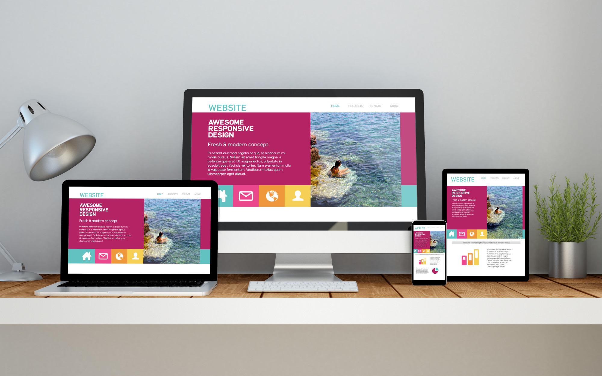
Testing your website on multiple devices is also crucial to ensure that it is truly responsive. This includes testing on desktops, tablets, and smartphones with different screen sizes and resolutions. By testing on multiple devices, you can identify any issues with the website’s layout or design and make the necessary adjustments.
Finally, it’s important to ensure that your responsive website development in Mohali an ready and is accessible to all users, including those with disabilities. This means designing with accessibility in mind, such as using alt tags for images and ensuring that the website can be navigated using keyboard-only navigation. By prioritizing accessibility, you can create a website that is usable by everyone.
In conclusion, building a responsive website is critical for providing a great user experience on any device. By following these tips and tricks – starting with a mobile-first approach, using a responsive framework, using flexible grids and images, optimizing for page speed, testing on multiple devices, and prioritizing accessibility – you can create a responsive website that looks great and functions flawlessly. So, use these tips and tricks to build a responsive website that will impress your users and help your business succeed in the digital age.